Opt-in forms are crucial for building a strong email list and nurturing leads in digital marketing. They serve as the entry point for capturing valuable subscriber information and opening up a direct communication channel with your audience.
However, not all opt-in forms perform equally when it comes to conversion rates. To maximize subscriber acquisition and effectively engage your target audience, it’s essential to understand the different types of opt-in forms and their unique characteristics.
Understanding Opt-In forms and their importance
Opt-in forms are essentially signup forms that visitors use to subscribe to your email list. They act as a bridge between attracting potential customers to your website and converting them into engaged subscribers.
These forms play an important role in lead generation by:
- Enabling businesses to capture contact information from interested prospects.
- Establishing permission-based communication channels for nurturing leads.
- Facilitating targeted email marketing campaigns that drive conversions.
The strategic design and placement of opt-in forms can significantly impact their effectiveness in attracting subscribers and growing your email list.
Types of Opt-In forms and their conversion potential
There are many different types of opt-in forms, each with its own strengths and weaknesses when it comes to conversion rates. Let’s look at the most common types and explore what makes them unique:
1. Pop-Up Opt-In Forms
Pop-up opt-in forms appear as a separate window on top of your website content. They grab attention right away and can be very effective when used strategically.
Pop-ups are hard to miss, making them great for capturing leads quickly. You can set pop-ups to appear after a specific amount of time on the page, when a visitor is about to leave, or based on specific user behavior.
On the downside, popups can be hard to use on smaller screens like mobile devices. Also, pop-ups that appear too early or too often can annoy visitors and hurt user experience.
Optimization strategies:
- Use Exit-intent triggers to show pop-ups when visitors are about to leave the site, minimizing disruption.
- Offer relevant and valuable incentives to make the pop-up more compelling and justify the interruption.
- Customize the design and messaging to match your brand and target audience preferences.
2. Inline Opt-In Forms
Inline opt-in forms are smoothly integrated within the content of a webpage, often appearing at the end of blog posts or within article text. They blend naturally with the surrounding content and do not disrupt the user’s browsing flow.
Inline forms are less intrusive than pop-ups and can be contextually relevant to the content, increasing the likelihood of conversion. However, they may be less visible compared to other opt-in form types, as they rely on visitors scrolling through the content to discover them.
Best practices for design and placement:
- Place inline forms strategically within high-value content where visitors are most engaged and likely to convert.
- Use clear and compelling call-to-action (CTA) buttons that stand out from the surrounding content.
- Keep the form fields minimal and only ask for essential information to reduce friction and increase submissions.
3. Slide-In Opt-In Forms
Slide-in opt-in forms discreetly appear from the side or bottom of the screen as visitors scroll through the webpage. They are less intrusive than pop-ups but still grab attention without completely interrupting the user experience.
Slide-in forms provide a subtle yet effective way to present opt-in opportunities without overwhelming visitors. They allow users to engage with the website content before being presented with the opt-in form, increasing the likelihood of conversion.
Tips for creating compelling slide-in forms:
- Use eye-catching visuals and persuasive copy to make the slide-in form stand out and encourage engagement.
- Trigger the slide-in form at strategic points, such as when visitors have scrolled through a significant portion of the content or spent a specific amount of time on the page.
- Offer relevant and valuable incentives that align with the content or user interests to increase the perceived value of opting in.
4. Floating Bar Opt-In Forms
Floating bar opt-in forms are narrow, horizontal bars that remain visible at the top or bottom of the webpage as visitors scroll. They are persistent and constantly in view, making them highly noticeable without being overly intrusive.
Floating bar forms have a high visibility rate, as they remain present throughout the user’s browsing session. They offer a constant reminder of the opt-in opportunity, increasing the chances of conversion. However, their smaller size may limit the amount of information or incentives that can be displayed.
Customization options and best practices:
- Use contrasting colors and clear, concise copy to make the floating bar stand out and convey the value proposition effectively.
- Include a prominent and clickable CTA button to encourage immediate action.
- Consider using floating bars for time-sensitive offers or exclusive content to create a sense of urgency and encourage opt-ins.
5. Fullscreen Opt-In Forms
Fullscreen opt-in forms completely cover the webpage, requiring visitors to engage with the form or close it before accessing the content. They command full attention and eliminate distractions, making them highly effective for capturing leads.
Fullscreen forms have a significant impact on conversion rates due to their immersive nature and undivided focus. However, they can be seen as intrusive and disruptive to the user experience if not used carefully.
When to use and how to optimize:
- Save fullscreen opt-in forms for high-value offers or critical points in the user journey, such as accessing gated content or registering for an event.
- Design the form with a visually appealing layout, persuasive copy, and a prominent CTA button to maximize conversions.
- Offer a clear and easy way to close the form for visitors who are not interested, ensuring a positive user experience.
Factors influencing Opt-In form conversion rates
1. Design and Visual Appeal
The way your opt-in form looks can make a big difference in how many people sign up.
An attractive and well-designed form grabs attention and creates a good first impression. It also shows that you’re professional and trustworthy, which encourages people to engage with your form.
Here are some tips for designing great opt-in forms:
- Use a clean layout with plenty of whitespace to make it easy to read and focus on the important parts.
- Choose colors that match your brand and create a strong visual hierarchy to guide people’s attention.
- Add compelling visuals, like images or icons, to show the value of signing up and make the form more interesting to look at.
- Make sure the call-to-action (CTA) button stands out and uses words that encourage people to click.
To optimize your form, you can use A/B testing:
- Test different versions of your form to see which design elements lead to more sign-ups.
- Try out different layouts, color schemes, CTA button text, and visuals to find the best combination.
- Look at the results and use the winning versions to keep improving your opt-in form’s performance.
2. Offer and Incentives
Giving people something valuable in exchange for their contact information can really boost sign-ups. Incentives give people a concrete reason to share their email address. They show that there’s something in it for them.
Some effective incentives include:
- Discounts or exclusive promo codes for your products or services
- Free resources like ebooks, whitepapers, or templates related to your industry
- Access to exclusive content, webinars, or video series
- Free trials or demos of your product or service
To create incentives that people will love, you need to:
- Understand your target audience’s pain points, interests, and goals
- Tailor the incentives to specific segments of your audience for a more personalized offer
- Make sure the incentives are directly related to your business and provide real value to your subscribers
3. Placement and Timing
Where and when you show your opt-in forms can have a big impact on user experience and conversion rates. Putting your forms in strategic places ensures that people will see them and increases the chances of people signing up.
Here are some best practices for opt-in form placement:
- Place forms above the fold, where people can see them without having to scroll
- Put forms at natural transition points, like the end of blog posts or after key sections of content
- Use heatmap and scroll map data to find high-engagement areas and place forms there
When it comes to timing, you should:
- Delay pop-up forms for a few seconds to let people engage with the content before interrupting them
- Trigger forms based on visitor actions, like scrolling past a certain point or spending a specific amount of time on the page
- Avoid showing forms too often or repeatedly to prevent frustration and keep the user experience positive
Conclusion
Optimizing your opt-in forms is a critical part of building a successful email list and nurturing leads for your business. By understanding the different types of opt-in forms and how well they convert, you can make smart decisions about which forms to use on your website.
To get the most out of your opt-in forms, focus on creating designs that look great, offering incentives that people actually want, and strategically placing forms at key points in the user journey. Keep testing and optimizing your forms using A/B testing and analytics tools to find areas where you can improve.
By using the right opt-in forms and following best practices, you can significantly grow your email list, nurture leads, and drive conversions for your business.
Frequently Asked Questions
Q1. Is there a single “best” opt-in form type for all websites?
No, there isn’t a one-size-fits-all solution. The best opt-in form type depends on factors such as your website’s design, target audience, and specific goals. It’s essential to experiment with different form types and placements to find what works best for your website and audience.
Q2. How can I ensure my opt-in forms comply with anti-spam regulations?
To comply with anti-spam laws, make sure to:
- Clearly state what subscribers will receive by opting in (e.g., newsletter, promotions).
- Provide an easy way to unsubscribe or opt out in every email communication.
- Include your physical address or contact information in the opt-in form or confirmation email.
- Obtain explicit consent before adding individuals to your email list.
Q3. What are some common mistakes to avoid with opt-in forms?
Common mistakes to avoid include:
- Asking for too much information upfront, which can discourage visitors from completing the form.
- Using vague or generic language that fails to convey the value of opting in.
- Displaying forms too frequently or aggressively, leading to a negative user experience.
- Neglecting to test and optimize form design, placement, and timing for better conversion rates.
Q4. Are there tools available to help me create and manage opt-in forms?
Yes, there are various tools and platforms that can help you create, manage, and optimize opt-in forms, such as:
- Pop-up and opt-in form plugins for websites, such as OptinMonster, Sumo, or Thrive Leads
- Email marketing services like Mailchimp, Constant Contact, or Brevo.
- Landing page builders like Unbounce, LeadPages, or Instapage.
These tools provide pre-designed templates, customization options, and analytics to help you create effective opt-in forms and track their performance.
Q5. Can I use multiple types of opt-in forms on the same website?
Yes, you can use a combination of opt-in form types on your website to cater to different user preferences and maximize conversion opportunities. For example, you can have an inline form within your blog posts, a pop-up form triggered by specific actions, and a floating bar form for time-sensitive offers.
Just be mindful of not overwhelming visitors with too many forms and ensure a balanced user experience.
Q6. What are some creative ways to incentivize opt-ins and increase conversion rates?
Some creative ideas to incentivize opt-ins include:
- Offering personalized recommendations or quizzes that provide valuable insights based on user input.
- Creating a sense of exclusivity by offering access to a private community or members-only content.
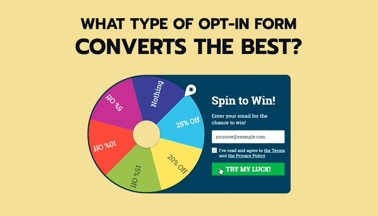
- Gamifying the opt-in process with interactive elements like spin-the-wheel or scratch-card reveals.
- Providing a free tool or resource that solves a specific problem or addresses a common pain point.
Remember to align the incentives with your target audience’s interests and needs to make them irresistible.
Q7. Are there any tools or plugins available to help optimize opt-in form conversion?
Yes, there are several tools and plugins that can help you optimize your opt-in forms for better conversion rates, such as:
- A/B testing tools like Google Optimize, Optimizely to compare different form variations and identify top-performing elements.
- Analytics platforms like Google Analytics or Hotjar to track visitor behavior, identify drop-off points, and gather insights for optimization.
- Heat mapping and scroll mapping tools like Crazy Egg or Lucky Orange to visualize visitor engagement and optimize form placement.
- Exit-intent technology plugins like OptinMonster or Privy to capture visitors’ attention before they leave your website.
These tools provide valuable data and insights to help you make data-driven decisions and continually improve your opt-in form conversion rates.


Share Your Thoughts: