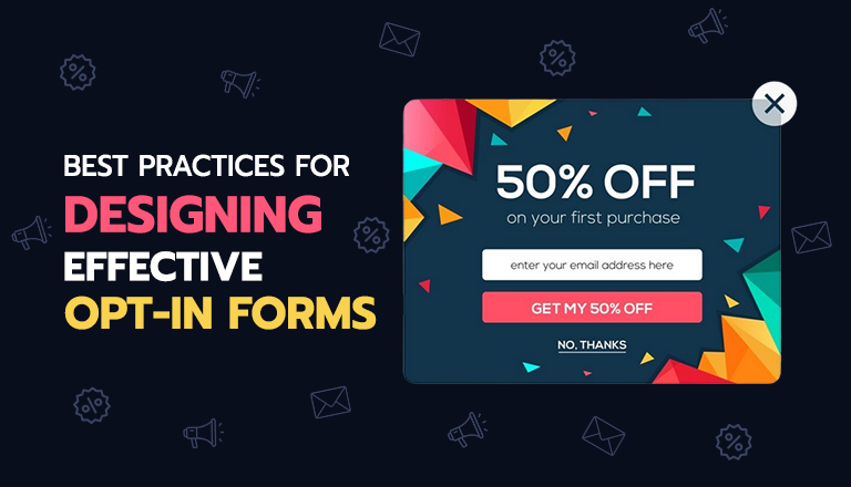
In the world of email marketing, building a strong and engaged email list is crucial for success. Opt-in forms are the gateway to capturing potential subscribers and growing your audience.
If you are not already using an opt-in form on your website, Convert Pro, OptinMonster, and ConvertBox are great options to get started with. Please check this article for a detailed overview of the best opt-in forms on the market.
However, simply having an opt-in form is not enough – it needs to be designed effectively to maximize conversions and ensure a positive user experience.
This article will explore the best practices for designing opt-in forms that not only attract subscribers but also align with your brand identity and messaging.
Importance of Opt-In Forms in Email Marketing
Opt-in forms play a vital role in email marketing strategies. They serve as the primary means for businesses to build their email lists, which are valuable assets for executing various marketing campaigns. By collecting email addresses from interested individuals, businesses can nurture relationships, share valuable content, and ultimately drive conversions and revenue.
The impact of well-designed opt-in forms on email marketing success cannot be overstated.
- According to a Sumo report, the top 10% of digital marketers achieve an impressive 4.77% opt-in conversion rate. Even more remarkable, elite marketers are converting up to 20% of their site traffic using opt-in forms! Harnessing the power of opt-in forms can truly revolutionize your lead generation efforts.
- A study by HubSpot reveals that 64% of website visitors who provide their email addresses go on to become paying customers, compared to a mere 2% of visitors who choose not to disclose their email information. This statistic underscores the immense potential for boosting sales and revenue by implementing effective opt-in forms on your website.
- Further insights from Optimonk reveals that the average conversion rate for pop-up forms is an impressive 11.09%, with cart abandonment popups and lucky wheels achieving even higher conversion rates of 17.12% and 13.23%, respectively.
These statistics highlights the importance of continuously growing and engaging your email list – a task made possible through effective opt-in forms.
Factors to consider when designing Opt-In Forms
To optimize your opt-in forms and effectively capture your target audience’s attention, consider the following key factors:
User experience: When creating opt-in forms, it’s crucial to prioritize the user experience, ensuring that visitors can easily understand and interact with your forms. Simplicity is key, so focus on providing clear, concise calls-to-action that guide users towards your desired action.
Design aesthetics: In addition to functionality, the visual appeal of your opt-in forms plays a significant role in capturing visitors’ attention and encouraging engagement. Aim for a clean and simple aesthetic that resonates with your audience while reinforcing your brand identity.
Mobile responsiveness: As mobile devices continue to dominate internet usage, it’s crucial to ensure that your opt-in forms are fully responsive and adapt seamlessly to various screen sizes. Implement a mobile-first approach, prioritizing the layout and functionality of your forms on smartphones and tablets.
Brand identity: Finally, maintain consistency in your messaging and branding throughout your opt-in forms. Incorporate your brand’s unique voice, tone, and visual elements to create a recognizable and memorable experience for visitors. Consistent branding helps build trust and credibility, increasing the likelihood of users engaging with your forms and ultimately converting into subscribers or customers.
Best Practices for designing Opt-In Forms
1. Clear and Compelling Copy
When crafting your opt-in form, focus on using language that persuades visitors to subscribe. Ensure your copy is clear and concise, immediately conveying the value proposition and benefits of signing up.
To make your message more compelling, try employing persuasive techniques like creating a sense of urgency, highlighting exclusivity, or emphasizing the value of the content or offers you’ll provide. Don’t forget to make your calls-to-action (CTAs) prominent, action-oriented, and aligned with your brand voice.
2. Minimalist Design
When it comes to opt-in form design, simplicity is your best friend. Avoid overwhelming visitors with unnecessary elements that may distract them from the main objective. Instead, focus on essential components such as the form fields, CTAs, and a brief value proposition statement.
Use whitespace effectively to draw attention to the most important elements and create a clean, uncluttered aesthetic that encourages visitors to take action.
3. Strategic Placement
Where you place your opt-in forms can make a big difference in their visibility and conversion rates. To maximize their impact, position them on high-traffic pages like your homepage, blog posts, and popular landing pages.
Consider placing forms at strategic locations where visitors are most likely to engage, such as:
- After they’ve finished reading a blog post
- Before they exit a page (using exit-intent popups)
Don’t be afraid to experiment with different placements and monitor their performance to determine the most effective locations for your audience.
4. Offer Incentives
Offering incentives is a great way to encourage visitors to sign up for your email list. Consider providing discounts, free resources, or exclusive content that aligns with your target audience’s interests and needs.
When presenting incentives, clearly communicate their value proposition within the opt-in form to increase their appeal. Make sure the incentives you offer are relevant and desirable to your potential subscribers.
5. Use Visual Elements
Incorporating visuals, like images or icons, can help your opt-in forms stand out and enhance their overall appeal. When selecting visuals, opt for high-quality, relevant ones that complement your brand and messaging.
You can also use visuals to represent the incentive or content you’re offering, making it more tangible and enticing for potential subscribers. This can help them better understand the value they’ll receive by signing up.
6. Personalization and Segmentation
To increase the effectiveness and relevance of your opt-in forms, consider tailoring them to specific audience segments. Utilize dynamic content and personalized messaging based on factors like visitor behavior, location, or demographics.
By segmenting your audience and creating targeted opt-in forms that cater to their unique interests and pain points, you’ll demonstrate that you understand and value their specific needs. This personalized approach can significantly boost your conversion rates.
Testing, Tracking, and Optimization
Creating effective opt-in forms is an ongoing process that involves continuous testing, tracking, and improvement. By A/B testing various form variations, you can discover which elements resonate most with your audience and boost conversion rates.
Monitor essential metrics like conversion rates, opt-in sources, and subscriber growth to evaluate your form’s performance. Use tools such as Google Analytics, heatmapping software, and form analytics to understand user behavior and pinpoint areas for enhancement.
Regularly analyze your data and make informed decisions to optimize your opt-in forms. Experiment with different designs, copy, incentives, and placements to find the winning combinations that maximize conversions and subscriber growth.
Conclusion
Designing effective opt-in forms is a critical component of a successful email marketing strategy. By following the best practices outlined in this article, you can create opt-in forms that not only capture the attention of your audience but also provide a seamless and engaging experience.
Remember to focus on clear and compelling copy, minimalist design principles, strategic placement, enticing incentives, and the strategic use of visuals. Additionally, tailor your opt-in forms to specific audience segments through personalization and segmentation techniques.
By putting these best practices into action, you’ll be well-equipped to grow a robust email list and lay a solid groundwork for your email marketing initiatives. Feel free to dive deeper into additional resources, tools, and services that can further elevate your opt-in form design and overall email marketing approach.
Frequently Asked Questions
Q1. What is the ideal number of fields for an opt-in form?
The ideal number of form fields can vary based on your goals and target audience. However, it’s generally recommended to keep opt-in forms concise, with only the essential fields (e.g., email address, name). Fewer fields often result in higher conversion rates, as they minimize friction in the sign-up process.
Q2. What type of information should I collect in an opt-in form?
The information you collect should align with your marketing goals and respect user privacy. Common fields include email address, first name, and perhaps location or interests. Avoid requesting too much personal information upfront, as it can deter potential subscribers.
Q3. Where should I place opt-in forms on my website for maximum visibility?
Strategic placement is crucial for maximizing visibility and conversions. Popular locations include the homepage, top or sidebar areas, after blog posts, exit-intent popups, and dedicated landing pages. Experiment with different placements and monitor performance to find the most effective locations for your audience.
Q4. What are some effective lead magnets to offer in an opt-in form?
Effective lead magnets include ebooks, whitepapers, checklists, templates, webinars, discounts, or free trials. The key is to offer something valuable and relevant to your target audience that aligns with their interests and pain points.
Q5. What are some common mistakes to avoid when designing opt-in forms?
Common mistakes include using confusing or vague language, overwhelming visitors with too many form fields, neglecting mobile responsiveness, failing to offer incentives, and placing forms in obscure or low-traffic areas of your website.
Q6. Are there any legal considerations for opt-in forms?
Yes, there are legal considerations to keep in mind. Ensure that your opt-in forms comply with relevant privacy laws, such as the General Data Protection Regulation (GDPR) and the CAN-SPAM Act. Clearly disclose how you will use the collected information and provide an option for subscribers to opt-out or manage their preferences.


Share Your Thoughts: